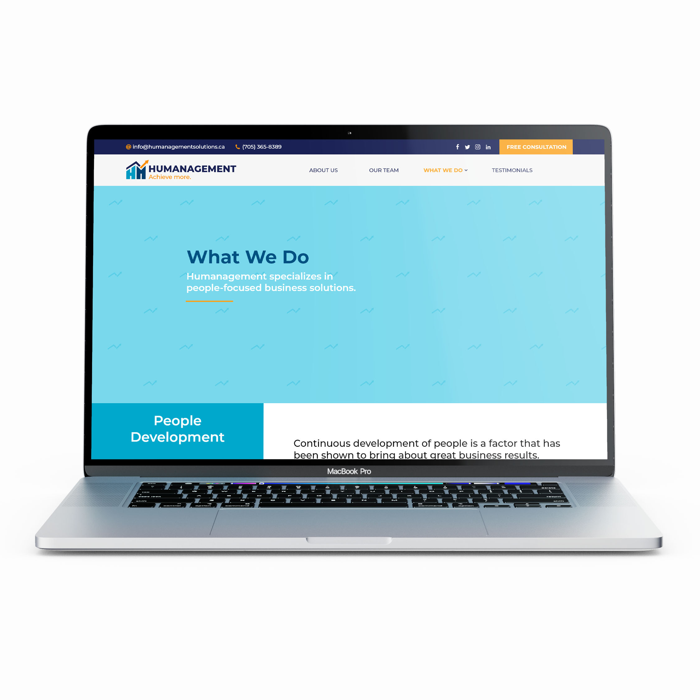
Humanagement
Categories
Branding | Print & Media | Web Design
See the creation of the brand identity of Humanagement, a business consulting company.
Team Member
Sophie
Date Created
May 2020

Humanagement
Categories
Branding | Print & Media | Web Design
See the creation of the brand identity of Humanagement, a business consulting company.
Team Member
Sophie
Date Created
May 2020
Project Goal
The goal of this project was to create a brand identity for Humanagement. This included creation of their logo, brand guidelines, website and other print & media components.
Project Goal
The goal of this project was to create a brand identity for Humanagement. This included creation of their logo, brand guidelines, website and other print & media components.
Humanagement is a small consulting business based in Timmins, Ontario. In their rebranding, they wanted the brand’s personality to be more bold and exciting.
Since this was a rebrand, our client wanted to keep some aspects of the logo similar to keep a familiar feel for returning customers.
Humanagement is a small consulting business based in Timmins, Ontario. In their rebranding, they wanted the brand’s personality to be more bold and exciting.
Since this was a rebrand, our client wanted to keep some aspects of the logo similar to keep a familiar feel for returning customers.
Brand Creation
Brand Creation
Brand Creation
Previous Logo
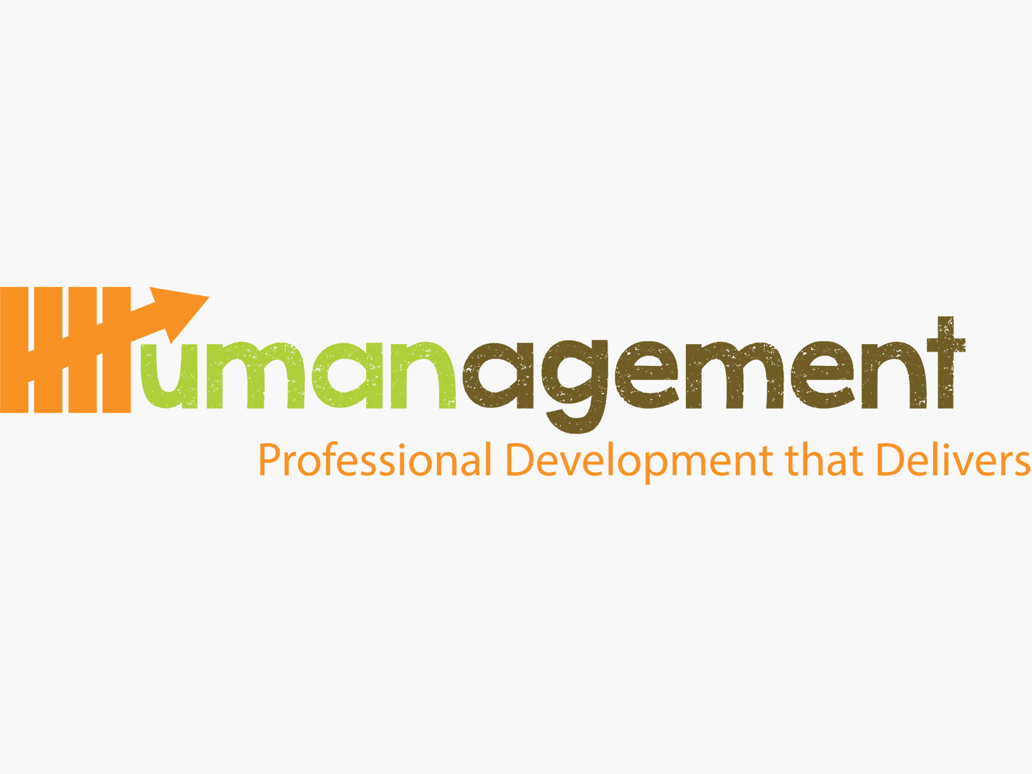
When updating the logo, our client wanted to keep at least one similar element from the previous logo.
Sketching Process
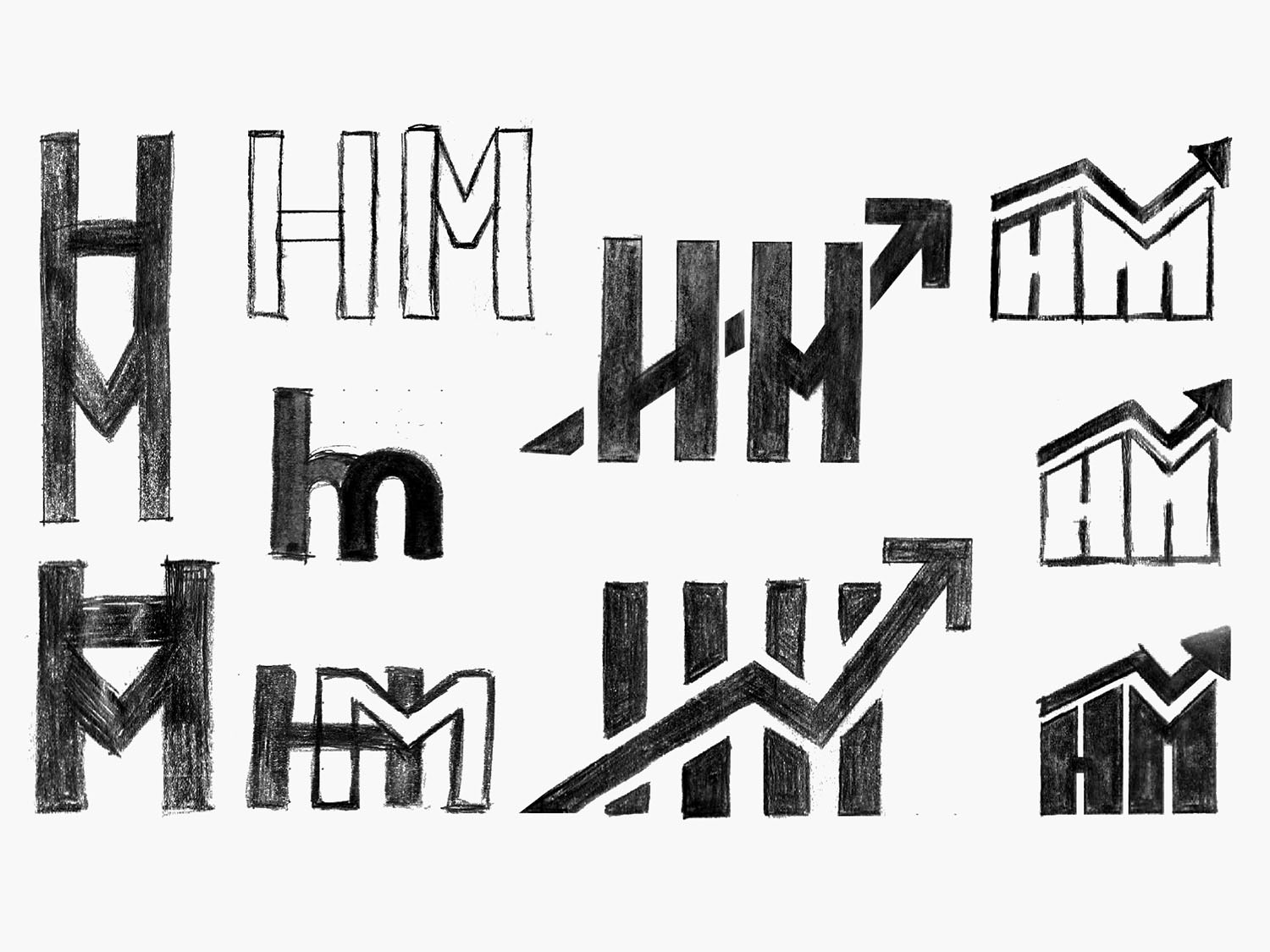
Our client expressed people had difficulties recognizing the symbol as the "H" in Humanagement.
Previous Logo

When updating the logo, our client wanted to keep at least one similar element from the previous logo.
Sketching Process

Our client expressed people had difficulties recognizing the symbol as the "H" in Humanagement.
Colour Palette

Blue was chosen since it represents a feeling of stability and reliability. Orange was chosen since it can foster encouragement, motivation and determination.
Typeface

Montserrat was picked for its bold impactful look. It has multiple weights which makes creating hierarchy with a single typeface possible.
Colour Palette

Blue was chosen since it represents a feeling of stability and reliability. Orange was chosen since it can foster encouragement, motivation and determination.
Typeface

Montserrat was picked for its bold impactful look. It has multiple weights which makes creating hierarchy with a single typeface possible.
Final Logo


The final logo is done in multiple versions to fit various situations. There are 5 versions of the Humanagement logo: horizontal, wordmark, vertical, vertical without slogan, and icon.
Final Logo


The final logo is done in multiple versions to fit various situations. There are 5 versions of the Humanagement logo: horizontal, wordmark, vertical, vertical without slogan, and icon.
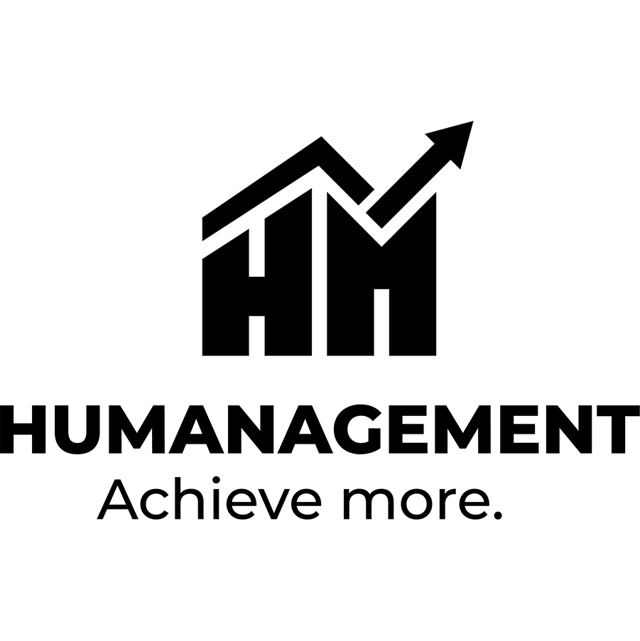


The final logo is also done in multiple colours to fit various backgrounds or situations when the full colour logo cannot be used.


The final logo is also done in multiple colours to fit various backgrounds or situations when the full colour logo cannot be used.
Brand Guidelines
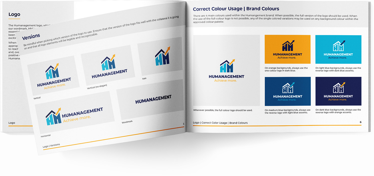
A brand guideline booklet was created to help use our brand consistently. Brand guidelines include sections such as: logo, typography, colour palette, & visual style.
Brand Guidelines
A brand guideline booklet was created to help use our brand consistently. Brand guidelines include sections such as: logo, typography, colour palette, & visual style.

Print & Media
Print & Media
Print & Media
Stationery
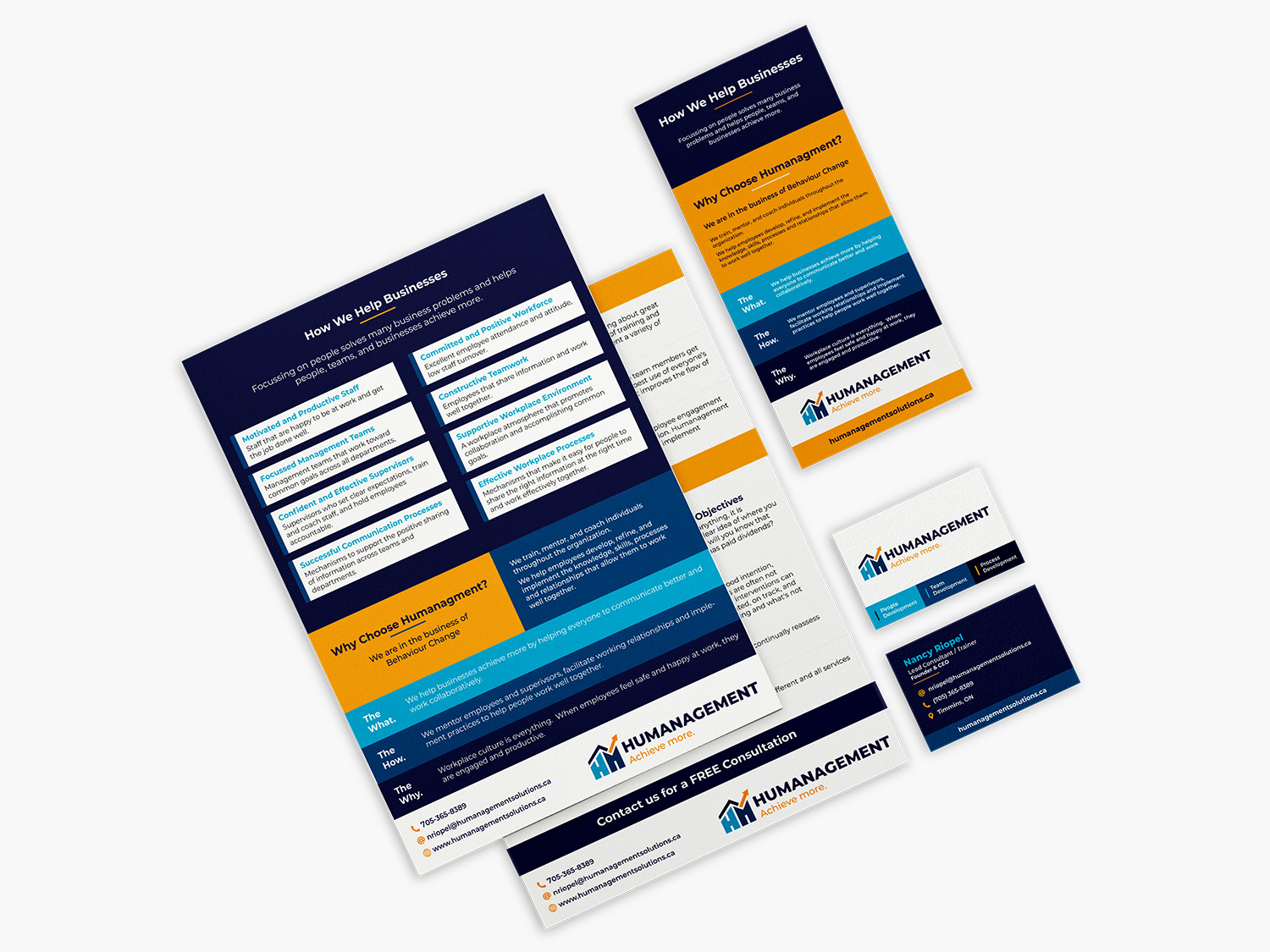
Includes a double-sided pamphlet, tri-fold pamphlet, and business card.
Email Signatures
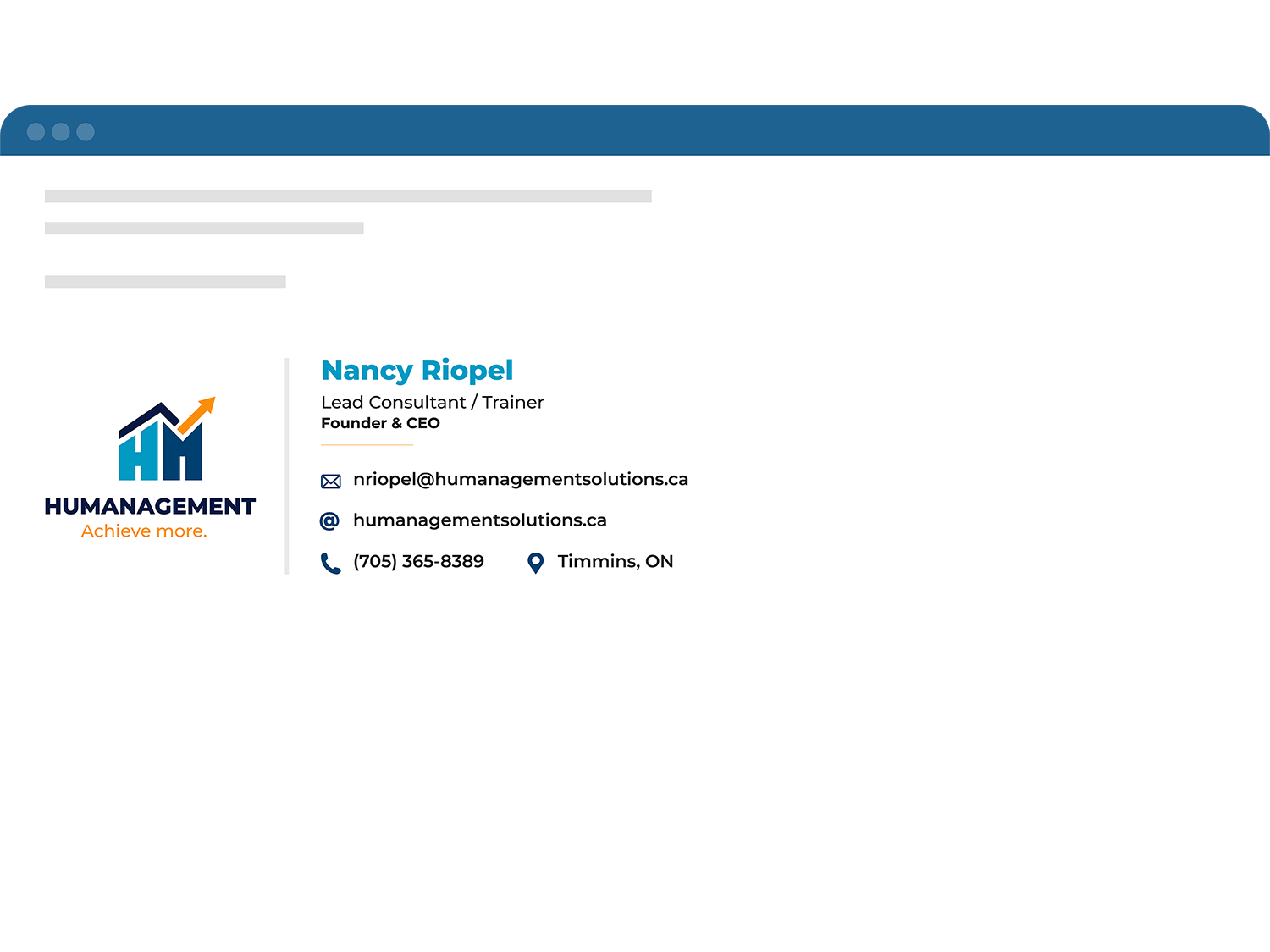
Made with interactive elements.
Social Media
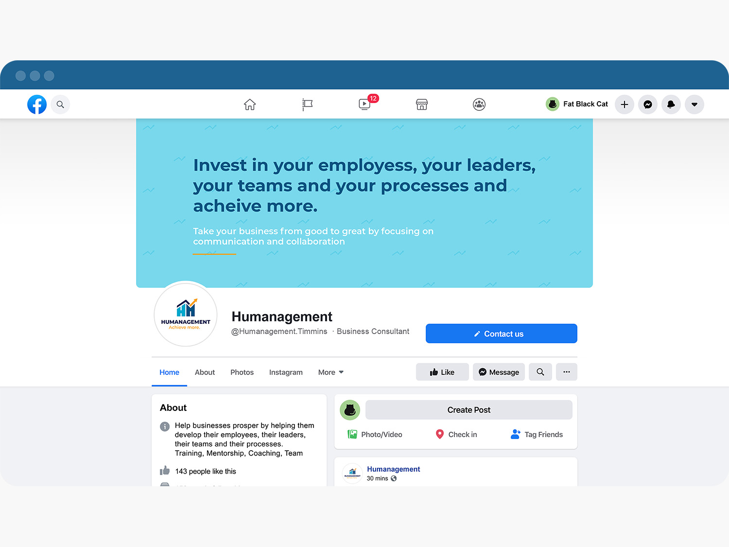
Social media profiles set up.
Digital Advertising

Made with interactive elements
Stationery

Includes a double-sided pamphlet, tri-fold pamphlet, and business card.
Email Signatures

Made with interactive elements.
Social Media

Social media profiles set up.
Digital Advertising

Made with interactive elements

