Timmins Family Counselling Center
Categories
Branding | Print & Media
See the creation of the brand identity of Timmins Family Counselling Center.
Team Members
Sophie & Jack
Date Created
February 2022

Timmins Family Counselling Center
Categories
Branding | Print & Media
See the creation of the brand identity of Timmins Family Counselling Center.
Team Member
Sophie & Jack
Date Created
February 2022
Project Goal
The goal of this project was to update the logo and brand identity for the Timmins Family Counselling Center. This included creation of a new logo, brand guidelines, and other print & media components.
Project Goal
The goal of this project was to update the logo and brand identity for the Timmins Family Counselling Center. This included creation of a new logo, brand guidelines, and other print & media components.
Timmins Family Counselling Center (TFCC) is a bilingual non-profit family service organization. They help foster healthy communities by offering professional counselling, psychotherapy, and education in Timmins and the surrounding area.
With their new brand, they wanted it to be more inclusive and eye catching. Our client wanted to give their brand a fresh look that better represents their business.
Brand Creation
Brand Creation
Brand Creation
Previous Logo

With the new logo, our client wanted a design that had no similarities to their previous logo as they felt it didn't represent them.
Sketching Process
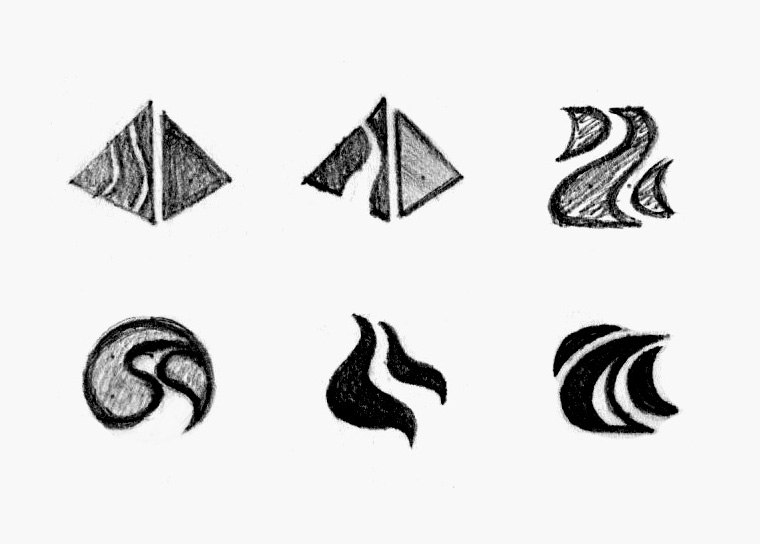
Our client mentioned wanting a triangle/prism to represent Maslow's hierarchy of needs and a path to show the journey through counselling.
Previous Logo

With the new logo, our client wanted a design that had no similarities to their previous logo as they felt it didn't represent them.
Sketching Process

Our client mentioned wanting a triangle/prism to represent Maslow's hierarchy of needs and a path to show the journey through counselling.
Colour Palette

Royal blue was chosen as blue is associated with a feeling of stability and reliability. Orange encourages motivation and determination.
Typeface
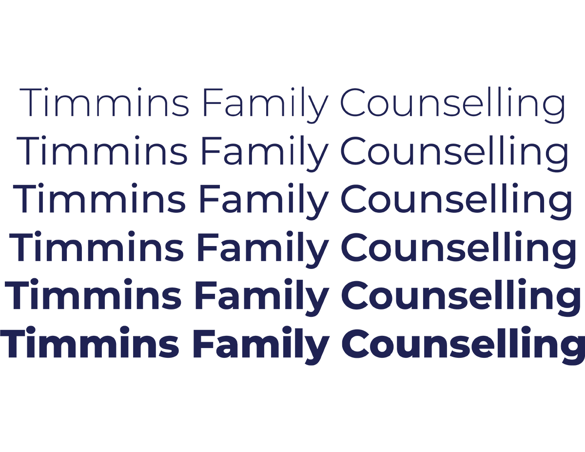
Montserrat is a bold and modern font that has multiple weights which makes creating hierarchy with one typeface easy to achieve.
Colour Palette

Royal blue was chosen as blue is associated with a feeling of stability and reliability. Orange encourages motivation and determination.
Typeface

Montserrat is a bold and modern font that has multiple weights which makes creating hierarchy with one typeface easy to achieve.
Other Concept
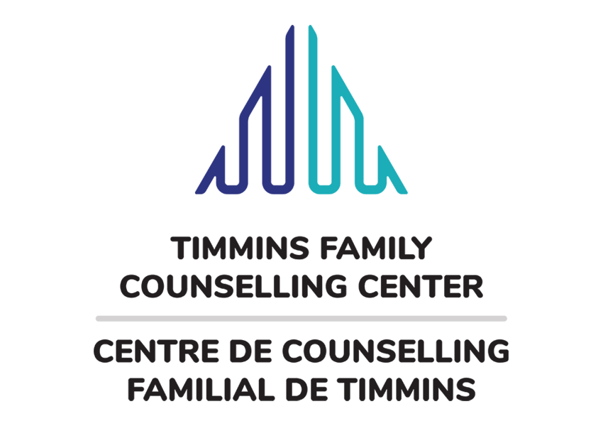

Two initial concepts were presented to our client to choose from. This is the other option that our client decided not to go with.
Other Concept


Two initial concepts were presented to our client to choose from. This is the other option that our client decided not to go with.
Final Logo
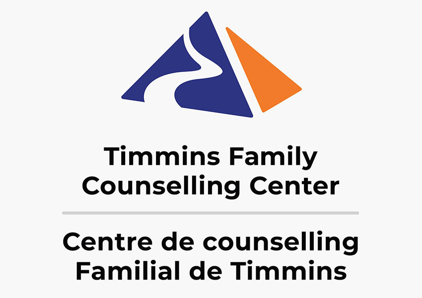

The final logo is done in multiple versions to fit various situations. There are 3 versions of the Timmins Family Counselling Center logo: vertical, icon, and horizontal.


The final logo is also done in multiple colours to fit various backgrounds or situations when the full colour logo cannot be used.
Final Logo


The final logo is done in multiple versions to fit various situations. There are 3 versions of the Timmins Family Counselling Center logo: vertical, icon, and horizontal.


The final logo is also done in multiple colours to fit various backgrounds or situations when the full colour logo cannot be used.
Brand Guidelines
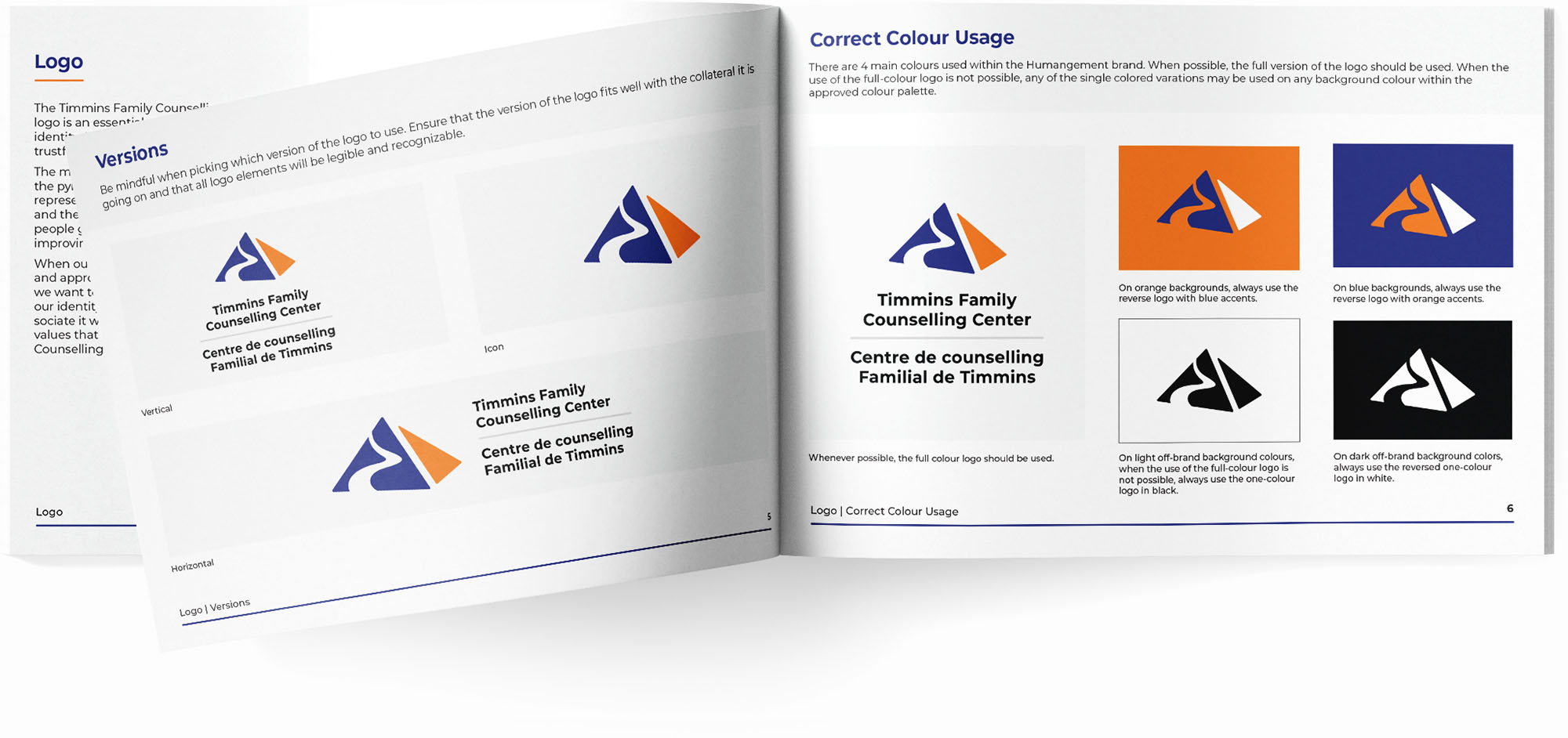
A brand guideline booklet was created to help use our brand consistently. Brand guidelines include sections such as: logo, typography, colour palette, & visual style.
Brand Guidelines
A brand guideline booklet was created to help use our brand consistently. Brand guidelines include sections such as: logo, typography, colour palette, & visual style.

Print & Media
Print & Media
Print & Media
Business Cards
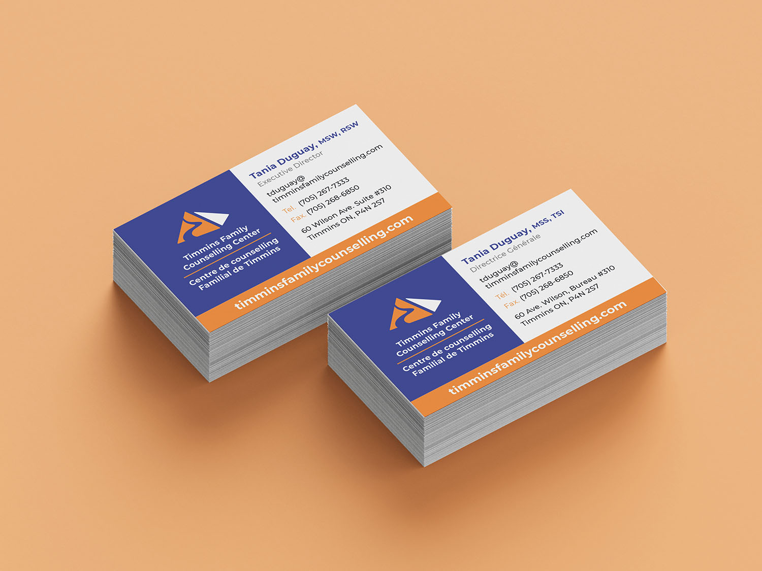
Designed a 3.5" x 2" card.
Letterhead
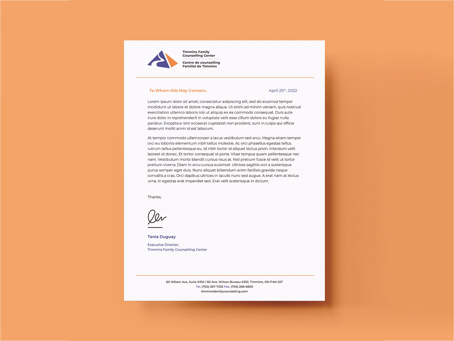
Made for standard 8" x 10" papers.
Brochure
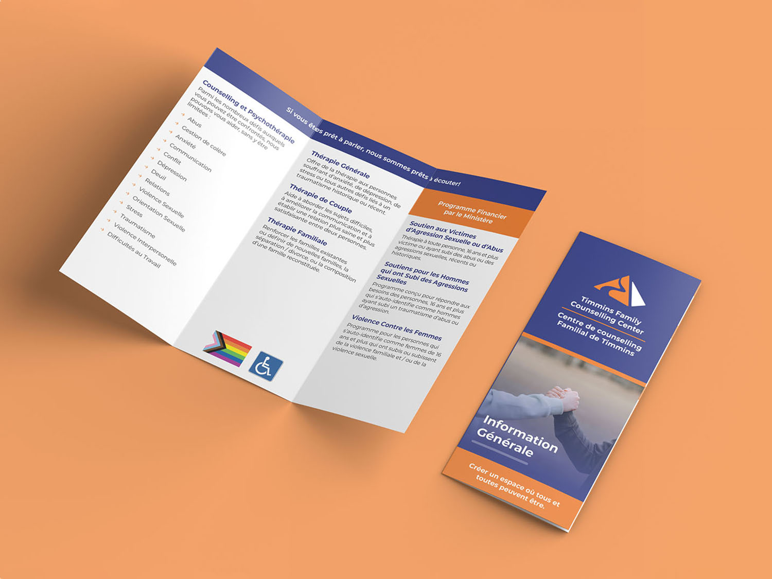
Designed as a inward fold brochure.
Handout
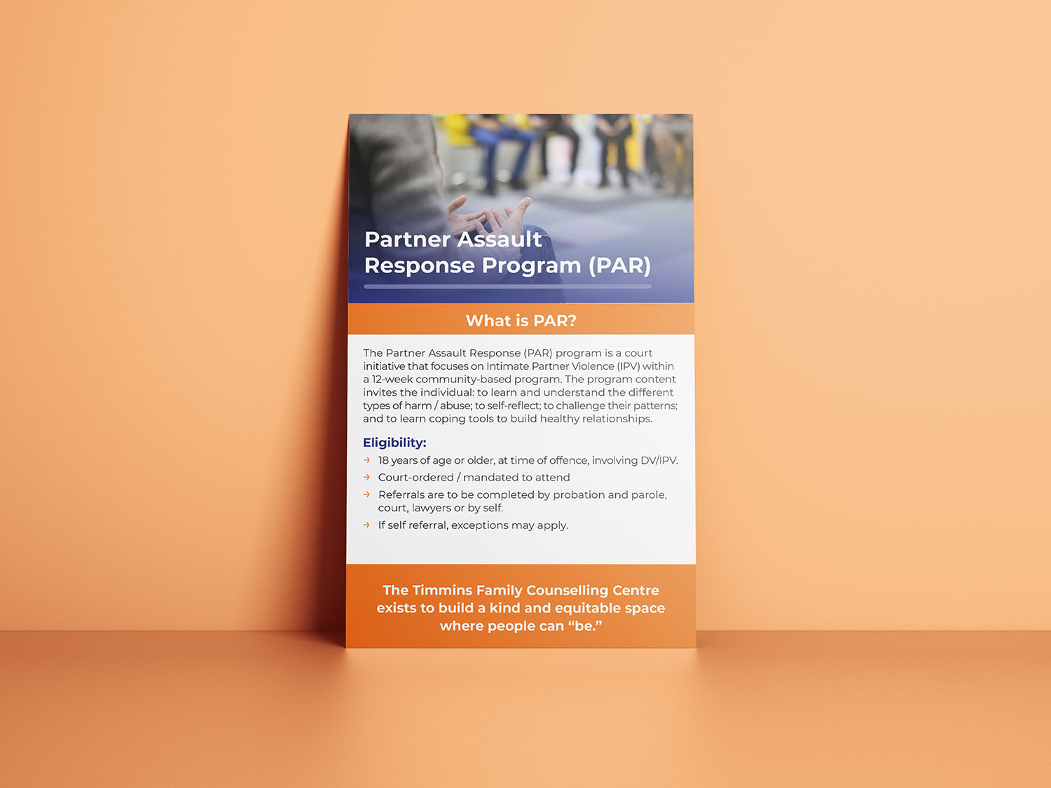
A double sided 5.5" x 8.5" handout.
Business Cards

Designed a 3.5" x 2" card.
Letterhead

Made for standard 8" x 10" papers.
Brochure

Designed as a inward fold brochure.
Handout

A double sided 5.5" x 8.5" handout.

